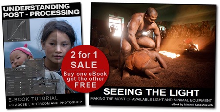
Special two-for-one Sale on my eBooks

eBooksale I’m holding a SALE for both of my eBooks this week. You buy either one of them and you get the other free. So, folks, anyone who hasn’t got these yet, now’s your chance. The offer lasts from November the 7th to the 14th.

Here’s the LINK or click the image above. Just click the “buy” button, under either eBook and after payment you’ll be automatically directed to a URL from which you can download both eBooks.

To get a better idea of what the eBooks are about see my past posts.

Understanding Post - Processing and Seeing the Light.

Now to what I’ve been up to. Over the past few days I’ve driven from Belarus to Hungary. I’m on my way to Romania and that’s where I hope to meet up with a couple of fellow photogs and explore some of the country’s most picturesque regions. I have to say - it’s fascinating seeing Eastern Europe this way, the only downside is that my wife isn’t with me for this part of the journey.  Due to some visa difficulties she’ll have to meet me later. In any case, I’m enjoying the trip. Traveling by car is much less exhausting than the motorcycle travel I’m used to. Heck, you can even sleep in the car. :)

Off to continue my drive. More to come soon.

My workshop revisited and thoughts on the post-processing tutorial.

Kyms-Image I know that I’m not posting to the blog very consistently, but hey, it’s challenging to think up meaningful content, while you’re also busy doing many other things. I’ll get better.

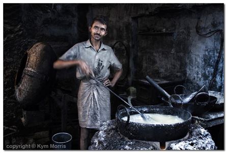
About the above photo - “Jodhpur Sweets-Maker”. It belongs to Kym Morris, the talented young woman who joined me for a private photo workshop around off-the-beaten-track Rajasthan. This was my favorite image of hers from our workshop. I remember that I was a little surprised when she showed it to me.

It’s not like Kym was clueless before the workshop, she already possessed a certain kind of vision, the stuff she was shooting was not captivating, but solid and the potential shone through. Once the workshop started I could see improvements every couple of days, but then in the final few days of the workshop I saw this shot and it was a few levels above anything else.

To me the image is the accumulation of much of what I tried to get across during the workshop (in regards to photographing on the streets) and that’s why I was so proud to see it. The things I spoke about – recognizing a photogenic situation, textures, color harmony and soft natural light – they are all here. On top of that there’s even a little motion blur in the hand, that makes the whole thing really come alive.

I guess some photography enthusiasts just need to be put onto the right path, then everything clicks and a transformation occurs. These are the people who can benefit most from a workshop (not just mine, I already mentioned some guys that I respect on my blog) and these are the photographers, Kym included, who I feel could find success photographing professionally.

Kym does not have a website yet, but she has a couple of images on "Onexposure". I'm sure there will be more soon. 

I’m thinking that it may be worthwhile to do a workshop in Indonesia next – Bali to East Java. This trip would really focus on what it’s like to be a travel photographer. The locations would vary, from tourist hotspots and spectacular landscapes like the Bromo volcano to absolutely unknown gems and photographing traditional villagers and fishermen.

These parts of Indonesia have lots to offer, just as much as India in many respects. Again I’d either make it a private workshop or something very small scale. My whole thing is reducing any impact on traditional villages. The last thing I want is more children running up to foreigners and screaming demands for pens, chocolates and money.

Once everything is in place, I’ll have the info on my website. Anyone who thinks this may be a thing for them, contact me here or via the email on my website. It’d definitely be a journey-of-a-lifetime type of experience.

To all those who have enquired about a post-processing tutorial – If I make one, I would like to make it rather good, spend a bit of time on it, go into detail. There’s some theory that I think is very necessary to understand before going crazy with new PP techniques and I’d like to touch up on it. There are just too many people replicating catchy post-processing techniques that just scream at you, but they’re doing it all wrong, without understanding. I don’t want to encourage that with my tutorials.

Anyhow, the tutorial would have illustrations, step-by-step how to, examples and a few words that touch up on the “Why?”. It’d take me some time to make one and I figure that charging from US$10-15 for a PDF would not be unfair. The money ain’t much for knowledge, but goes a long way for someone traveling around Asia - US$10 is basically a day’s worth of budget traveling in India:).

If anyone thinks that this way of delivering the tutorial is not a bad idea – tell me. If you think it’s rubbish, well, also tell me.
Demystifying Post-Processing (to an extent)

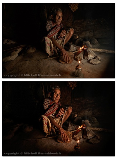
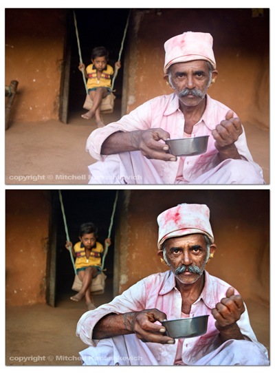
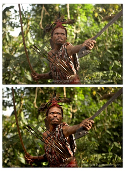
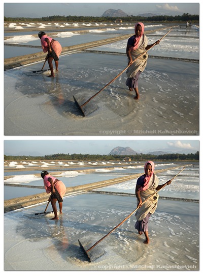
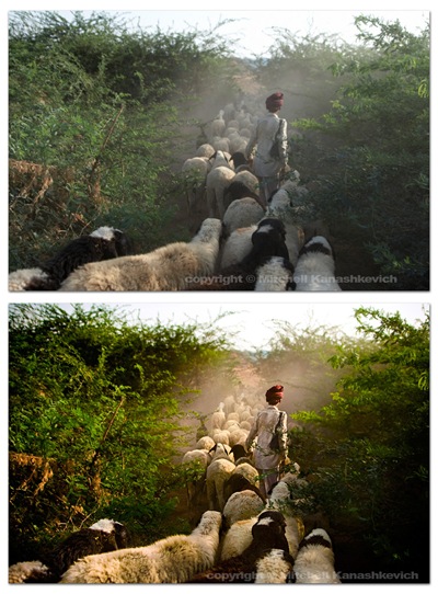
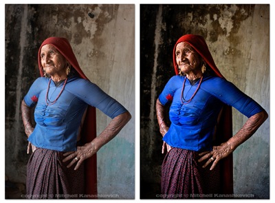
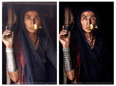
I said in the last post that I would put up some “before” and “after” images that would give people an insight into how much post-processing I do to my photographs, so here we go. As with the last post this isn’t a tutorial, but those who have a better than basic understanding of post-processing may get some ideas from this post. The “before” images which are unprocessed, as interpreted by “Caputre One”, they are on top and I have listed the key things which I have done with the post-processed "after" photographs. Click on each image for a closer view. Timor-FireBarda-HillsAlor-WarriorSalt-workersThe above images have pretty much been worked on in the same way.

  1. Slight cropping and sometimes rotating.
  2. Multiple versions of the same image created at varying exposures, later made into one in Photoshop. The reason – bringing out the details in highlights and shadows.
  3. Curves, levels adjustment layers created, I paint inside of these wherever I feel needed, to selectively darken and lighten areas
  4. Shadows and highlights – to further bring out the details.
  5. Dodging and burning for finishing touches.

ShepherdThe image above had a little more done to it. On top of the previously mentioned processes I played around with the saturation and the white balance in the RAW file. More intense dodging and burning was required to add a bit of drama to the scene, to make the image look the way I remembered seeing it.

GrandmotherThe process for the image of this grandmother was similar to the first few and I chose to clone out a little black pipe that stuck out of the wall (top/center/right). I’m not a huge fan of cloning things out and some may argue that once things start to get modified on this level, the photograph becomes less “pure”. If it’s something small that doesn’t make or break the image, but bugs me I’ll clone it out without thinking twice, if it’s something that can radically change an image I’ll usually be a bit more cautious.

Rabari-Woman Out of the images I have presented here this one required the most work. I felt that I really needed to bump the contrasts and to dramatically darken certain parts of the photo. This sRGB conversion has a limited color range and is actually a little too dark (you loose details in the material), but you get the general idea. Same processes as stated above and just really a lot of playing around and seeing what works and what doesn’t.

That’s about it. As you can probably gather I like to keep my images looking as realistic as possible on the one side and as dramatic as possible on the other. I try to find the right balance. There are plenty of photographers who like to make their images look more dramatic, more saturated, more contrasty,  to a point of surreal. There are also those who like to selectively de-saturate parts of an image, but to keep contrasts high. Lots of particular “looks” are popular these days and many people try to emulate them. Sometimes these “looks” work and sometimes they are boring, repetitive and unnecessary. I’m not really into stylizing my color shots too much. I feel that this is a bit of a fad and at times this stylization is used to mask crap light or inconsistent color. A great image will be great regardless of whether it has been realistically processed or stylized (when this is done well). A crap, stylized image may pass off as decent at first glance because it grabs you with the dramatic, surreal color, but hang it on the wall and look at it for a few days and you’ll become very bored. Maybe I am somewhat conservative - for me it’s either the dramatic, yet realistic post processing approach or if I want to do my own kind of stylizing – it’s black and white. I do quite a bit of black and white and I will post something about that in the future.